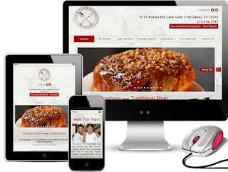
A great restaurant website gives visitors immediate
access to the information they’re seeking without sacrificing elegance
or style. While not every website needs to feature stylish,
of-the-minute visual content, the caliber of a restaurant’s website can
be perceived as correlating to the establishment’s overall quality. A
beautiful restaurant website design
featuring colors, photos, and fonts that match the restaurant’s overall
atmosphere, whether fun or formal, speaks to a restaurant that is run
with equal finesse. After all, a conscientious owner who holds exacting
standards could reasonably be expected to show meticulous effort and
thorough personal investment in all aspects of the business.
A restaurant’s website – for better or worse – gives visitors their first sense of the experience they can expect to have when they arrive to dine. A shabby, outdated website will not pass even the most cursory glance from an interested diner. Most prospective customers under the age of 55 will be browsing restaurant sites via smartphones, so at a minimum they will require a mobile responsive design. When a website lacks key features such as these, it is a clear sign that it hasn’t been updated with a good design for as many as five or six years! This first impression could discourage more diners than it draws in.
Visitors to a restaurant website are almost always in search of at least one of the following three things: hours of operation, menu, and telephone number. On the surface, this might seem like the kind of simple list a restaurant owner could trust to Yelp or Google. However, a beautifully-constructed website takes advantage of this initial interaction between diner and destination by offering this information quickly while also presenting an exclusive look at the restaurant’s ambiance and style.
When executed properly, a restaurant’s website connects squarely with the intended audience. If a restaurant intends to draw in college students but has a website that is overly stuffy and formal, it might fail to draw the “right” crowd despite being visually appealing. Conversely, a formal restaurant would never want to be associated with a sloppy, amateur design.
Although engaging with the customer and offering them information in a format that delights them might be enough of a reason to invest in a high-quality design, there’s much more that a well-built site can offer. A restaurant’s website can allow customers to make reservations, place orders, leave reviews, and access a “contact us” form directly.
This added functionality can relieve some of the workload from the restaurant staff, freeing them up to focus more on the customers who are directly in front of them. Such a direct improvement to the experience of the customers is almost certainly going to be observed, especially by regulars. In this way, even those who are less likely to access the website for things like the address or phone number will still benefit directly from the investment made to the company’s online infrastructure.


No comments:
Post a Comment